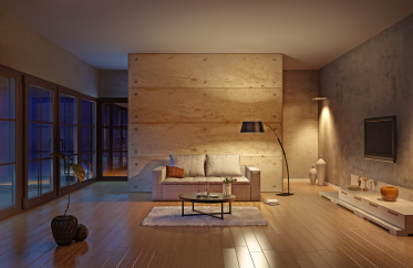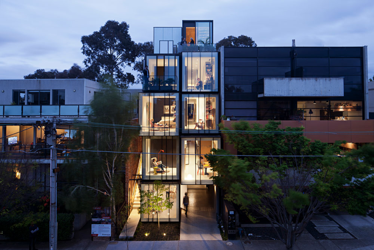
The Wellington Street Residence by Matt Gibson Architecture + Design uses lighting to define space and functions. Photograph by Shannon McGrath.
Remember the days before Instagram filters when family photos were cast with that not-so-lovely yellow tinge and images of your colleagues were a weird shade of blue? You’d wonder where those colours came from, as you couldn’t see them with your own eyes. The answer is simple: they were a reflection of the type of lighting present in the room.
These days, cameras and phones can detect the lighting conditions of a shot and automatically adjust what is called the white balance – producing images where the whites are as close to white as they can be and colour casts are shifted closer to the feeling of daylight. Though it involves some complex science, the take-home from some simple research is that choosing the right globes or LEDs for a room is just as important as the colour of your walls in achieving a well-balanced interior.
Technically a colour’s temperature is expressed using the symbol K, standing for Kelvin – a unit of measure for absolute temperature and every light fitting or globe has a rating. Generally speaking, the warm lights found in most homes have a rating of 2700 to 3000K while anything over 5000K is considered cool, being a more blueish white.
In the context of an interior, it is important to understand there are two types of light at play – the first being emitted and the second reflected. The colour of our walls is a result of emitted light being reflected and here’s where it gets a bit tricky.

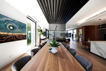
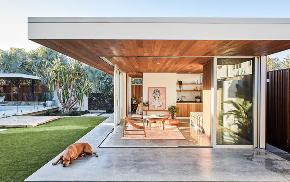
Recreating daylight in your home is simple if you choose the right lighting. Interior by Infinite Design Studio.
The colours we see are based on the wavelengths of light being both absorbed, and reflected, by the surface of an object. It is essentially the same principle that explains why the sky is blue and sunsets are red when there is dust or pollution in the air – we are seeing daylight filtered or refracted by particles in the atmosphere.
So back to the light source, and on the topic of the sun – daylight is the benchmark when it comes to man-made lighting. As well as having a temperature rating, every luminaire is rated using the Colour Rendition Index (CRI), where a CRI of 100 means it is capable of rendering the qualities of daylight – great for art galleries where a work needs to be represented according to the artist’s vision.
In countries where days are short, lighting is a crucial part of life, with Seasonal Affective Disorder (SAD), or the winter blues, being a common issue in Scandinavia. To overcome this, some lighting designers have created products that go as close as possible to replicating the colour and feeling of daylight and there are now light-therapy clinics that aim to do the same thing.
Interestingly, colour temperature and CRI are also used to trick us, with supermarkets using different lighting in the fruit and meat sections to make things look better than they actually may be and long-haul flights using colour temperature to wake us up or send us off to sleep.
As sinister as this all sounds, these tricks have applications in the home. We all know that a paint swatch looks different at home than it does in the hardware store, but how do we put all this tech-talk together to create the mood that is right for us?
The kitchen
Aim for the top end of the spectrum here, being 5000K and above, to bring the feeling of daylight in before the sun comes up. You can always add a pendant with a warmer tone over the bench or table to create mood in the evenings, though the permanent fixtures should keep you happy and focused while you cook.
The living room
You don’t want to feel like you are sitting in an art gallery while you chill out with family or friends, so a warmer (2700 to 3000K) and dimmable globe or LED will not only set the tone, but also make timbers and leather look suitably inviting.
The bedroom
There is a reason Apple introduced the Night Mode setting: it shifts the screen’s colour temperature from cool to warm and helps you get to sleep after browsing or watching a flick. Like the living room, the lower and warmer end of the Kelvin range should set you off for a decent night’s sleep.
The home office
You may work in your PJs, but you can’t be seen to be falling asleep at the desk. A warm light in your home office will take you there and have further consequences for your mood, productivity and vision. A bright, cool light source that reflects daylight (5000K-plus) is perfect here.
Ultimately, when choosing your permanent lighting, the consideration of a room’s function and the times of day, or night, it will be used are crucial. When briefing your architect or designer, the same applies – they can distil the science, so you don’t need to filter it later.
WRITTEN BY HouseLab